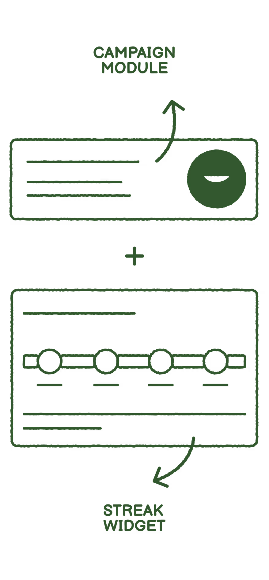

Building the campaign visual tooklit
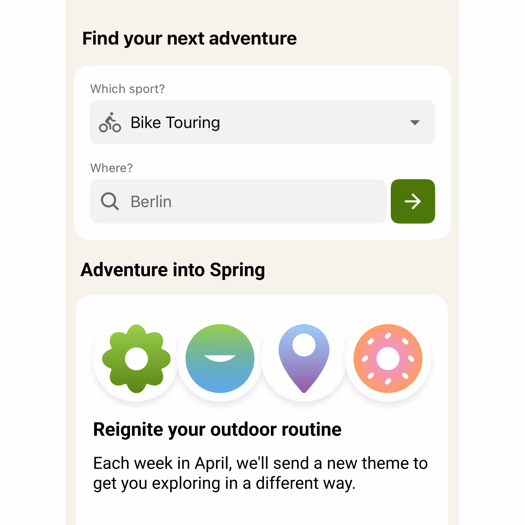
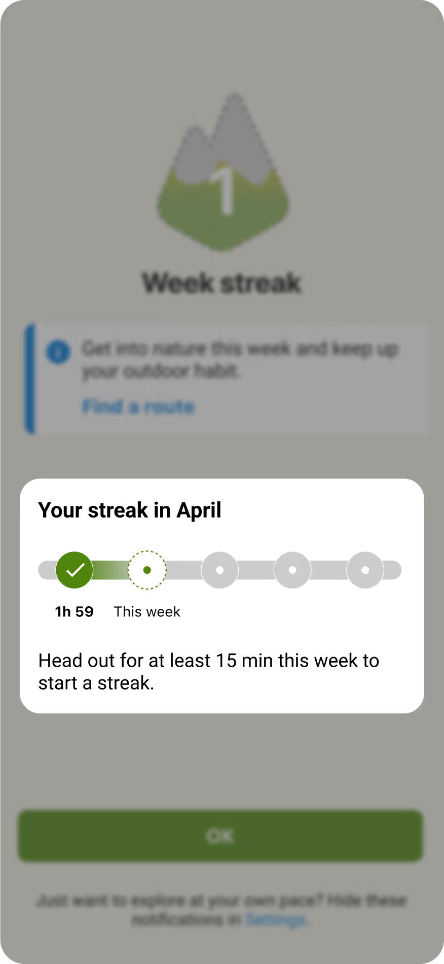
The mechanics and most of the UI of the streaks feature was nearly complete when I joined the project, so my role was to build on top of it. I developed the campaign’s visual language and worked with the copy team to refine the narrative, ensuring everything came together as one cohesive experience in the product.
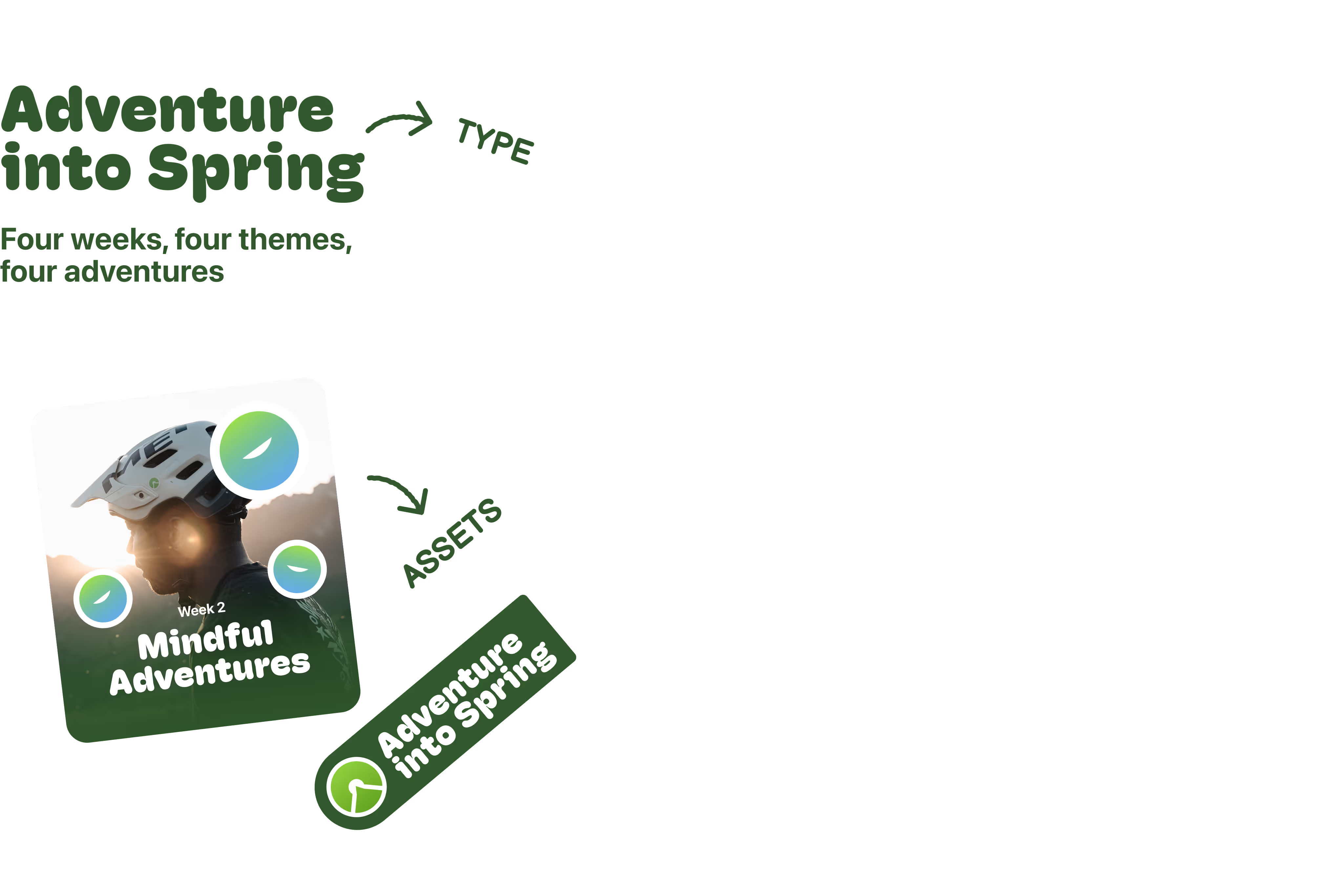
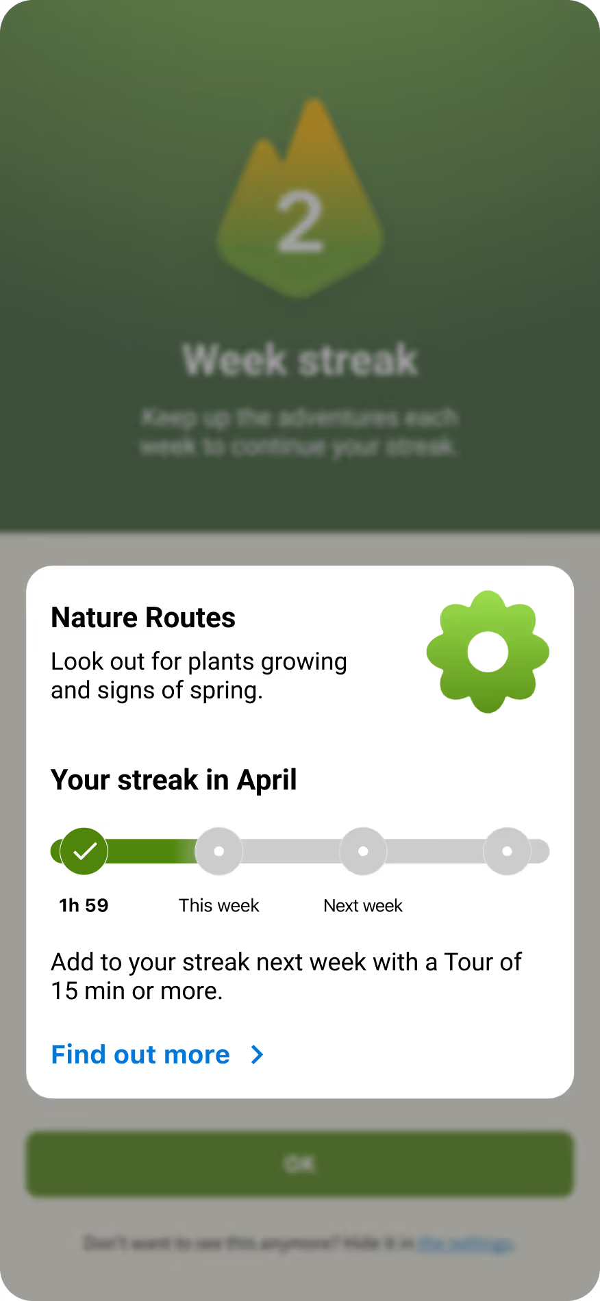
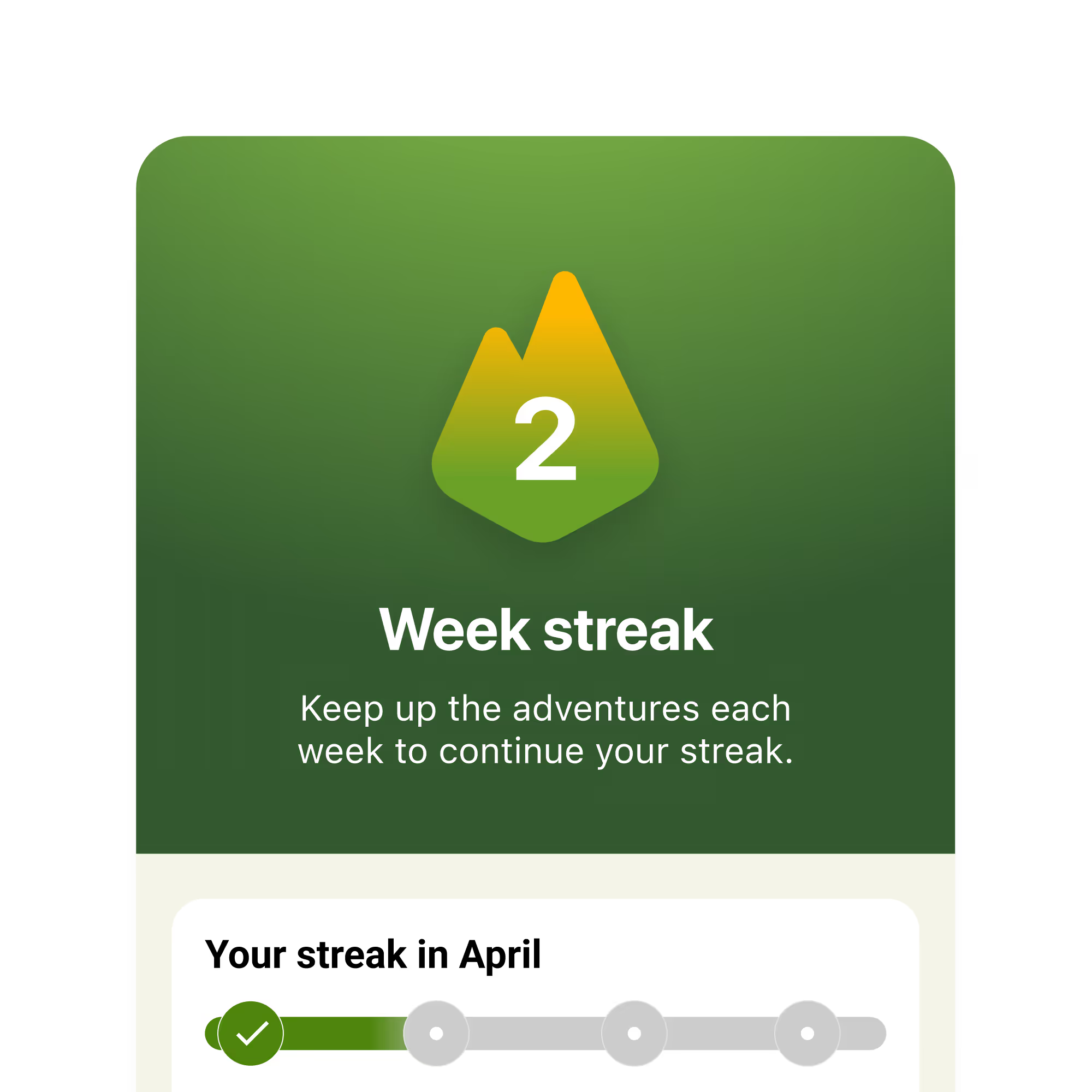
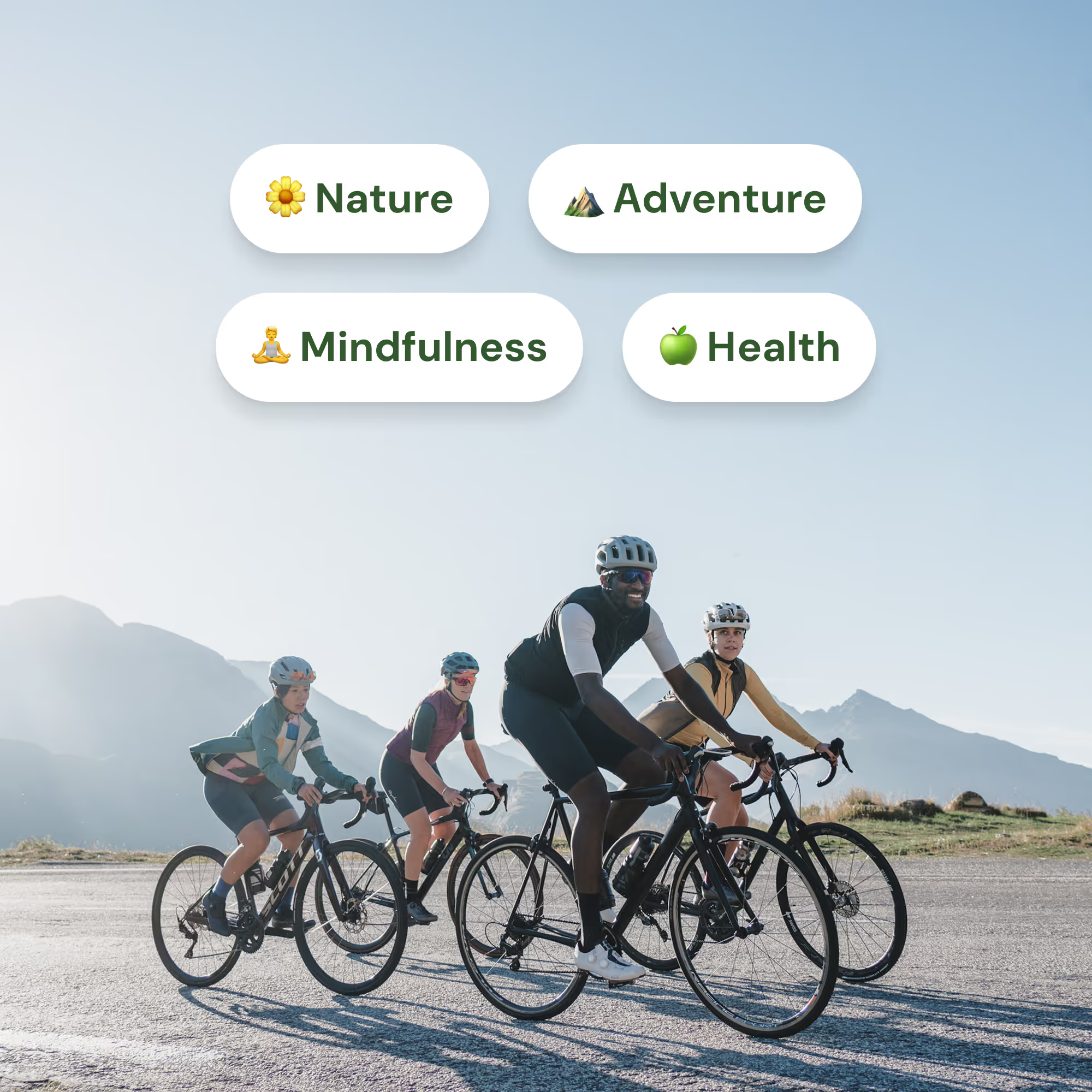
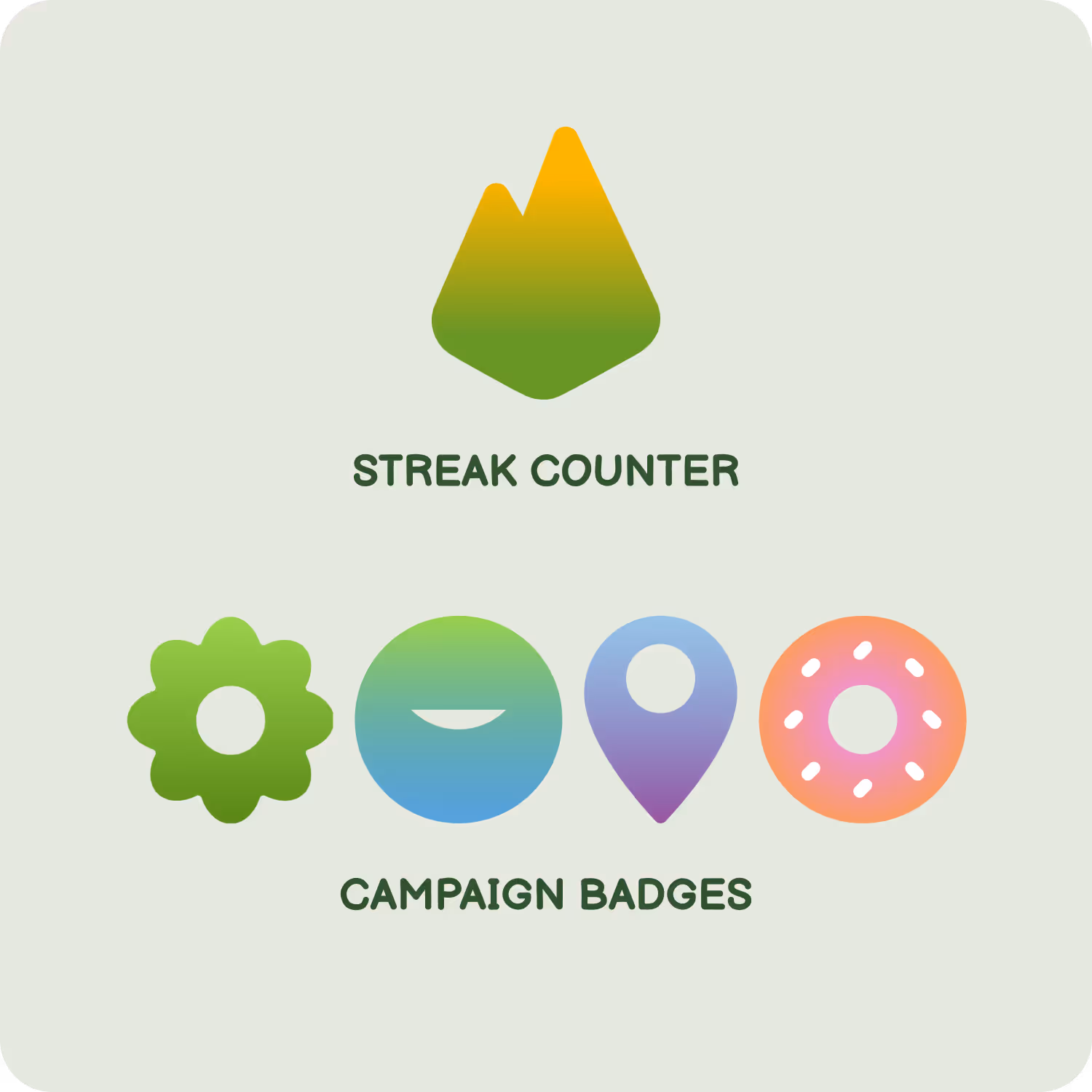
One visual for each week of the month
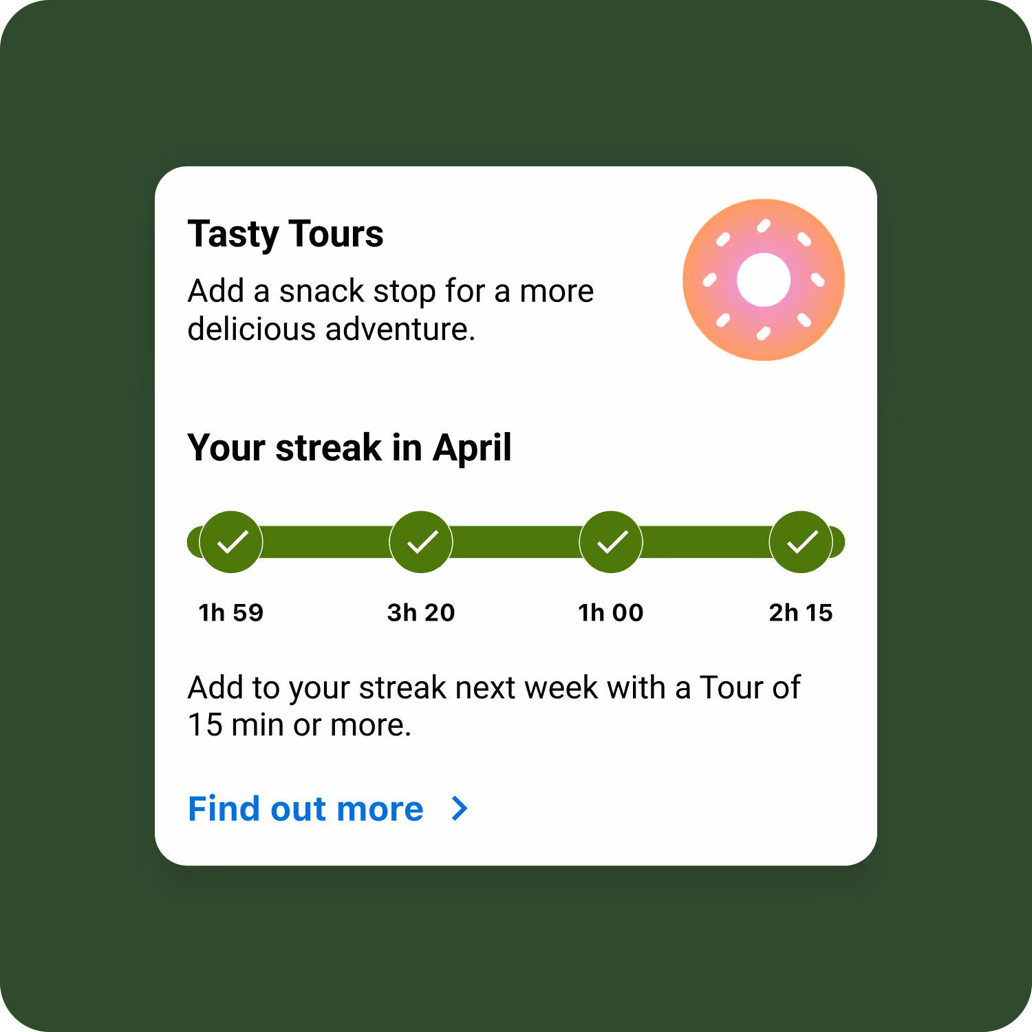
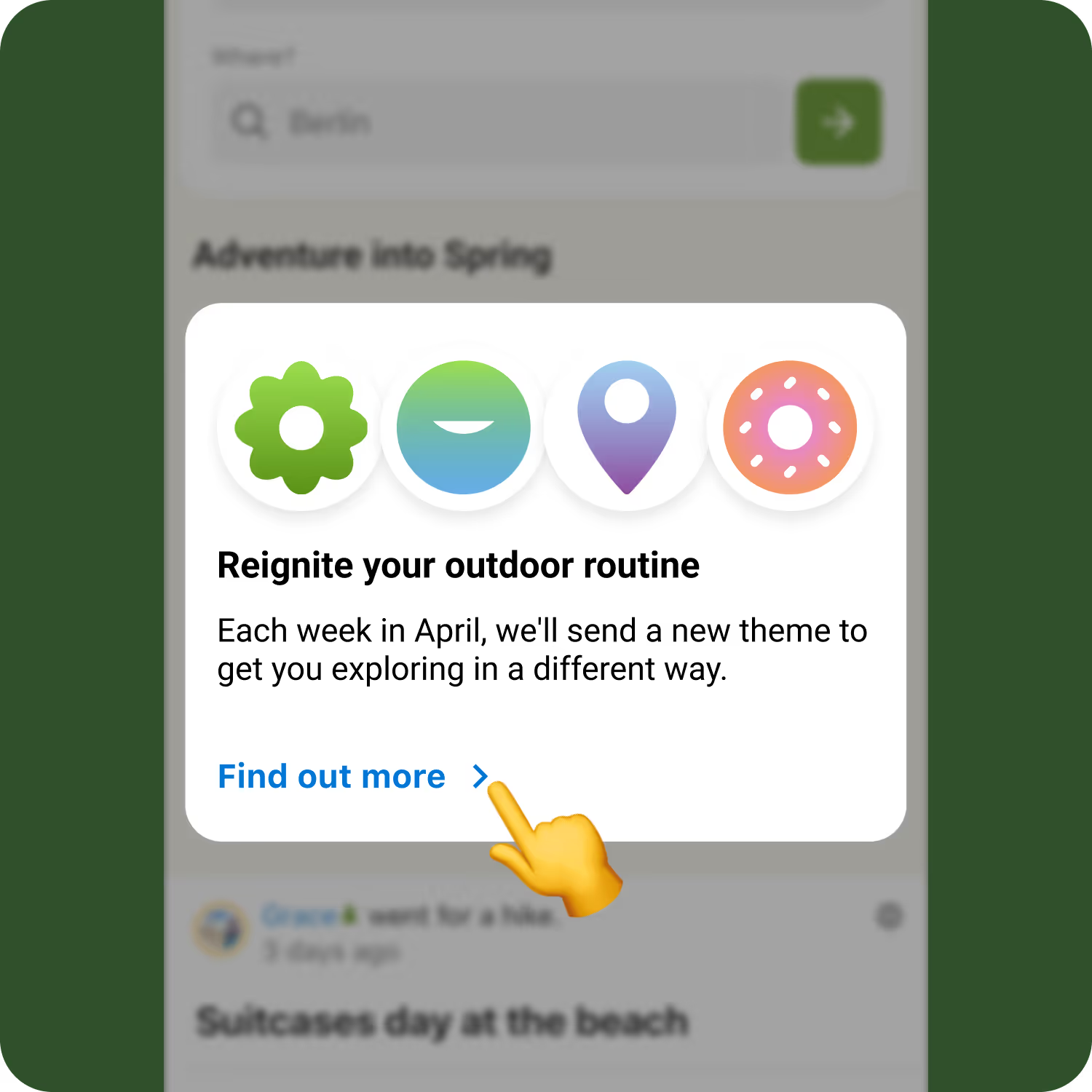
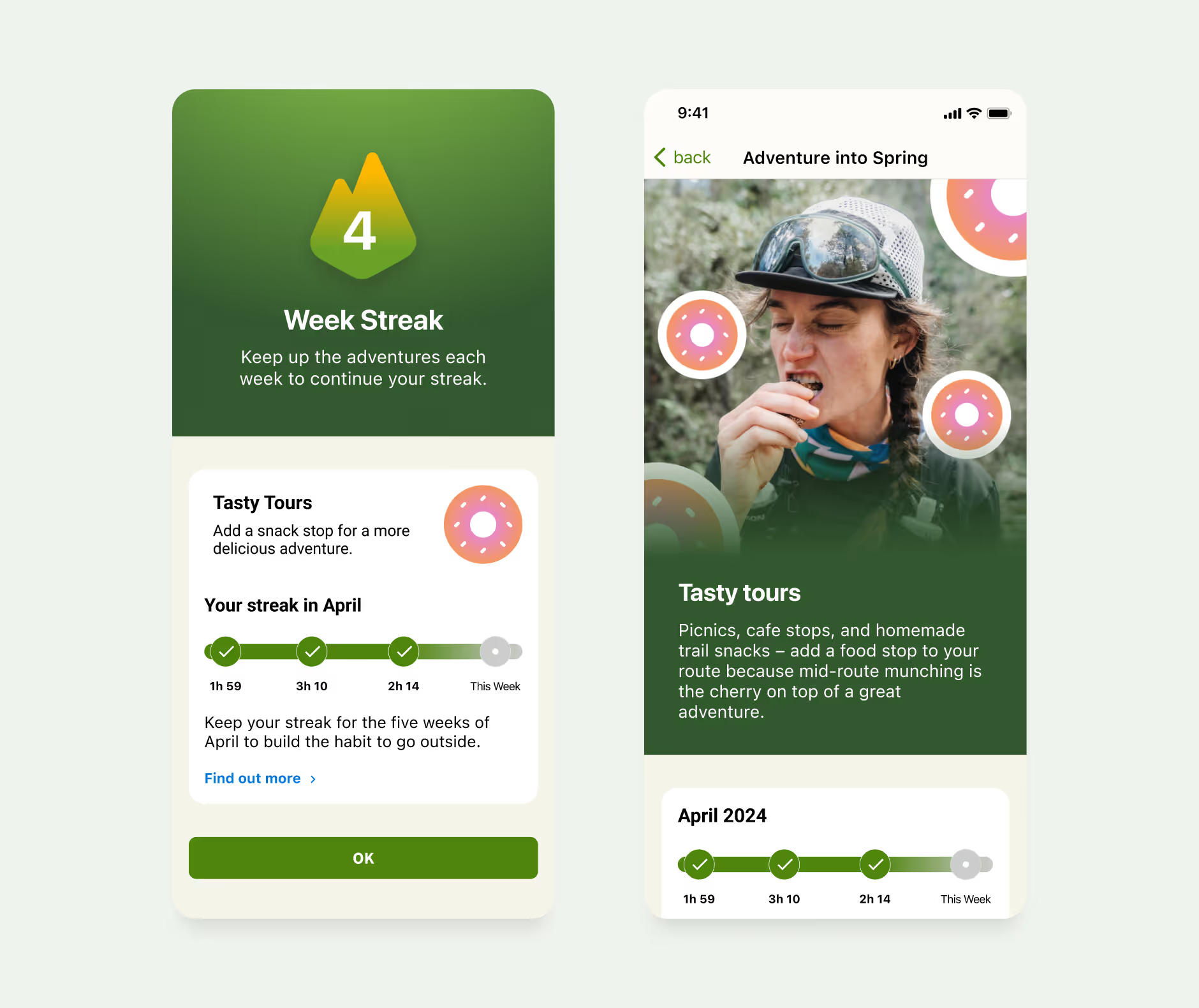
The first step was to design a set of elements for each week's theme. Using the streak counter as a reference, I created four visuals that captured the campaign’s narrative topics: nature, mindfulness, landmarks, and picnic pauses.
Choosing the typography for the campaign
After defining these basic shapes, I looked for a font that would complement them. Given their rounded and playful character, I chose the heavy variant of Hoss Round, a friendly-looking font with soft, rounded curves that feels approachable despite its bold weight.
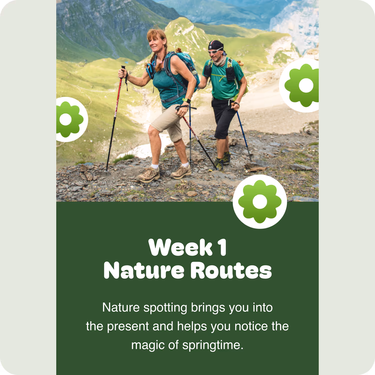
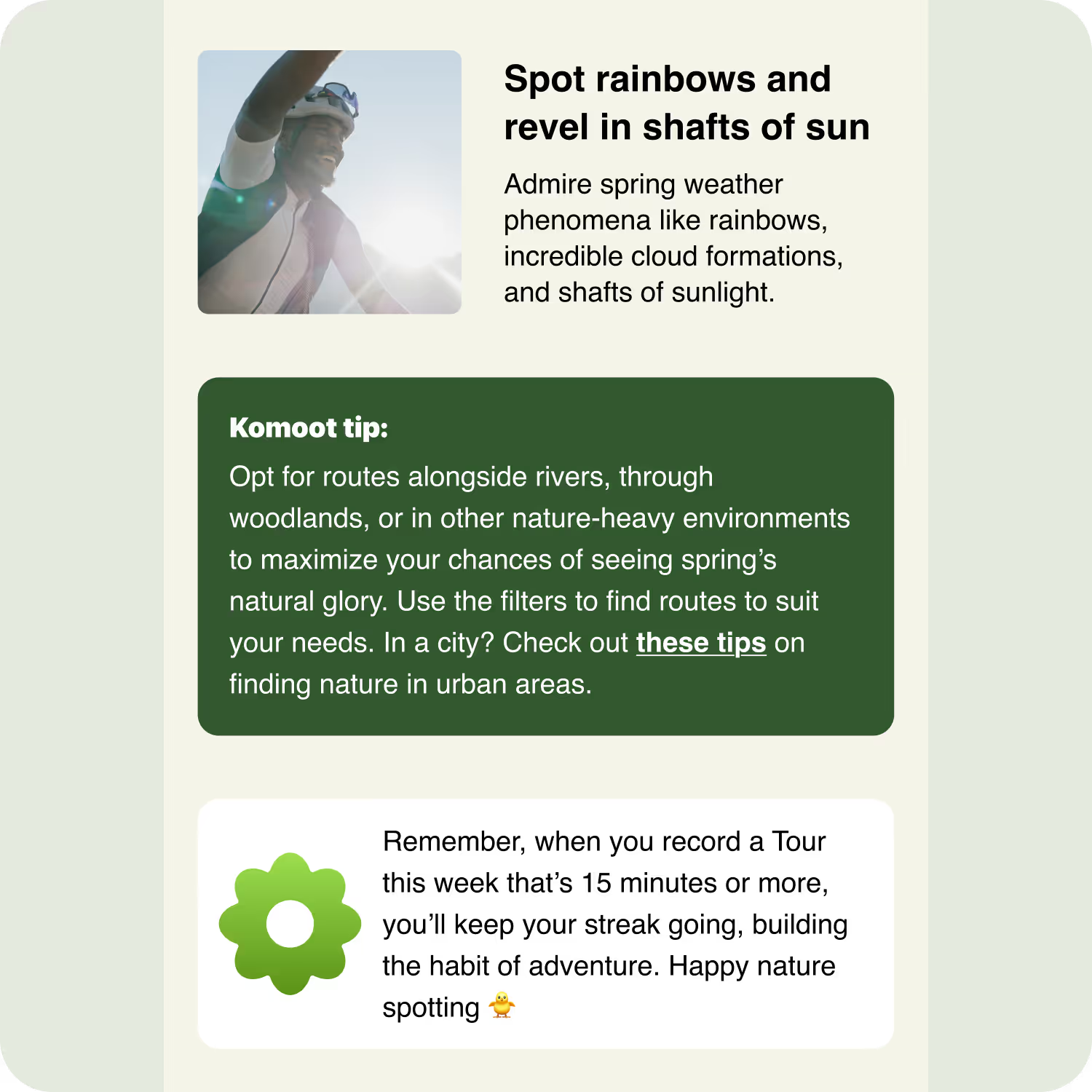
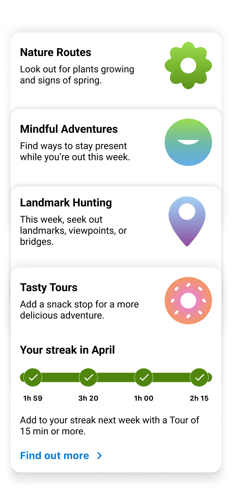
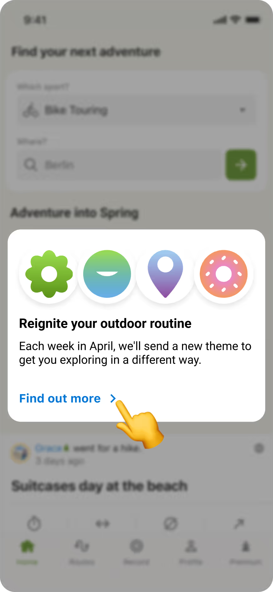
Choosing the imagery and putting everything together
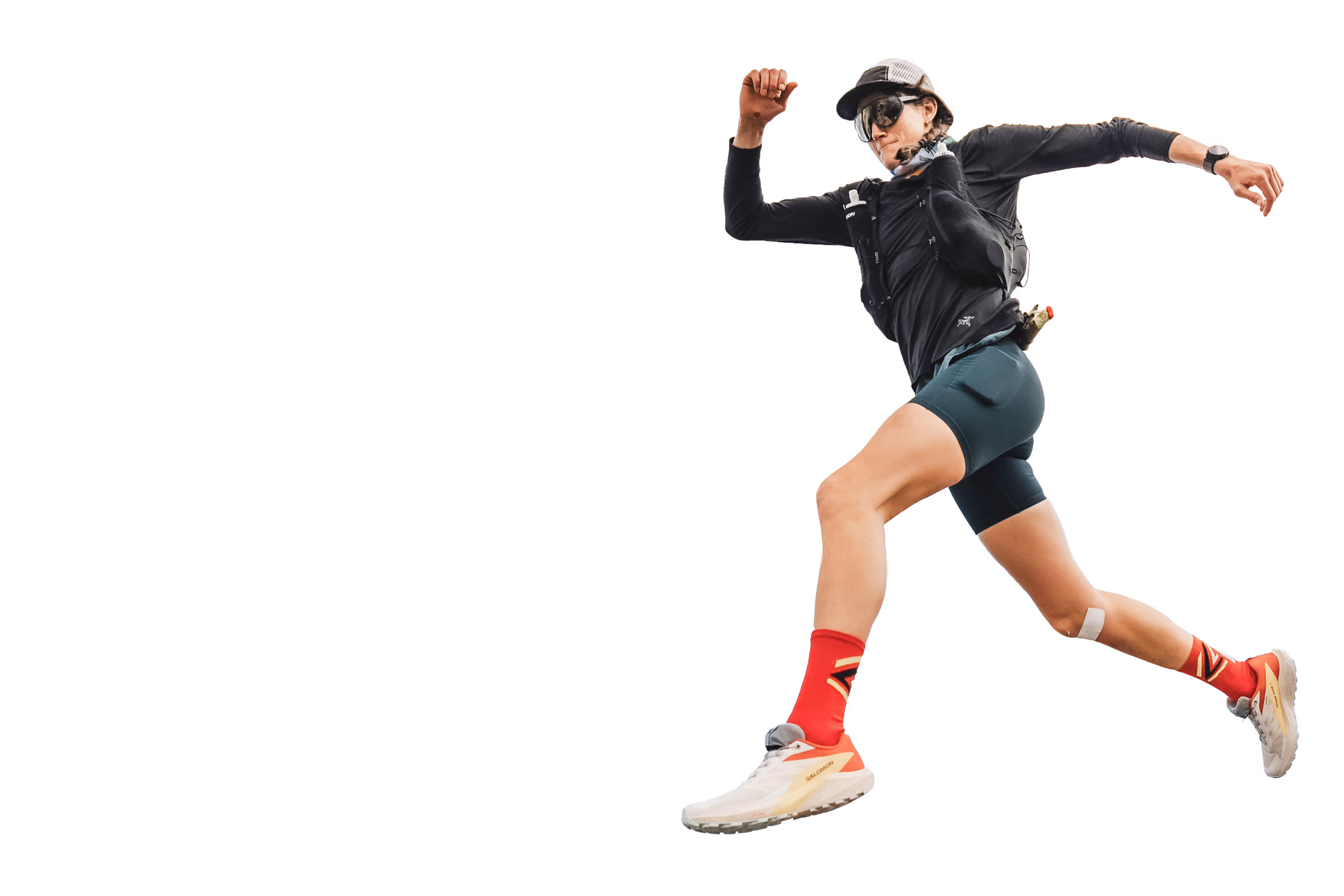
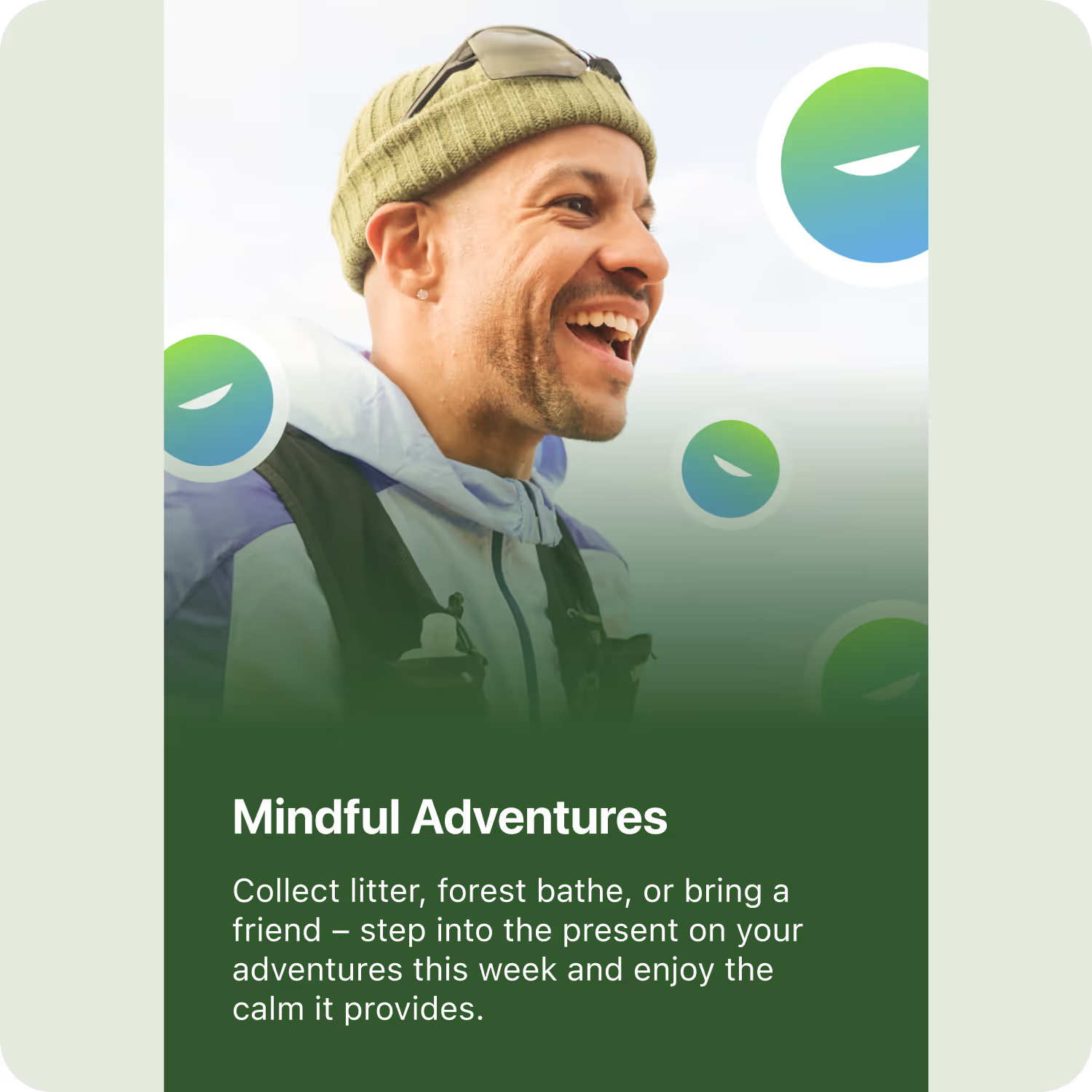
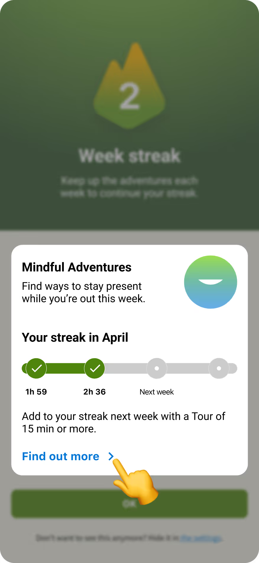
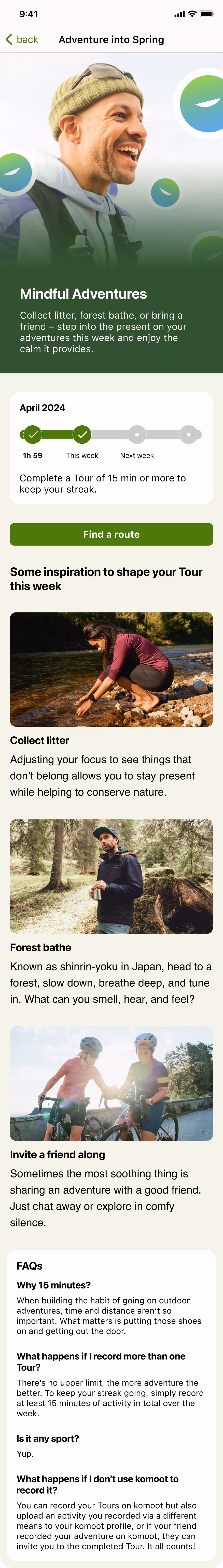
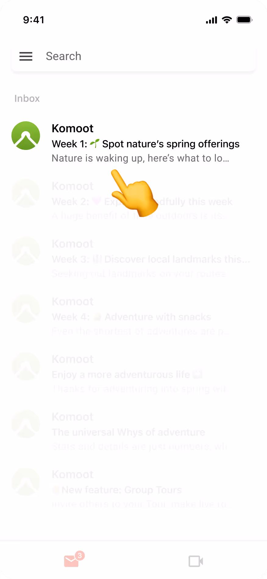
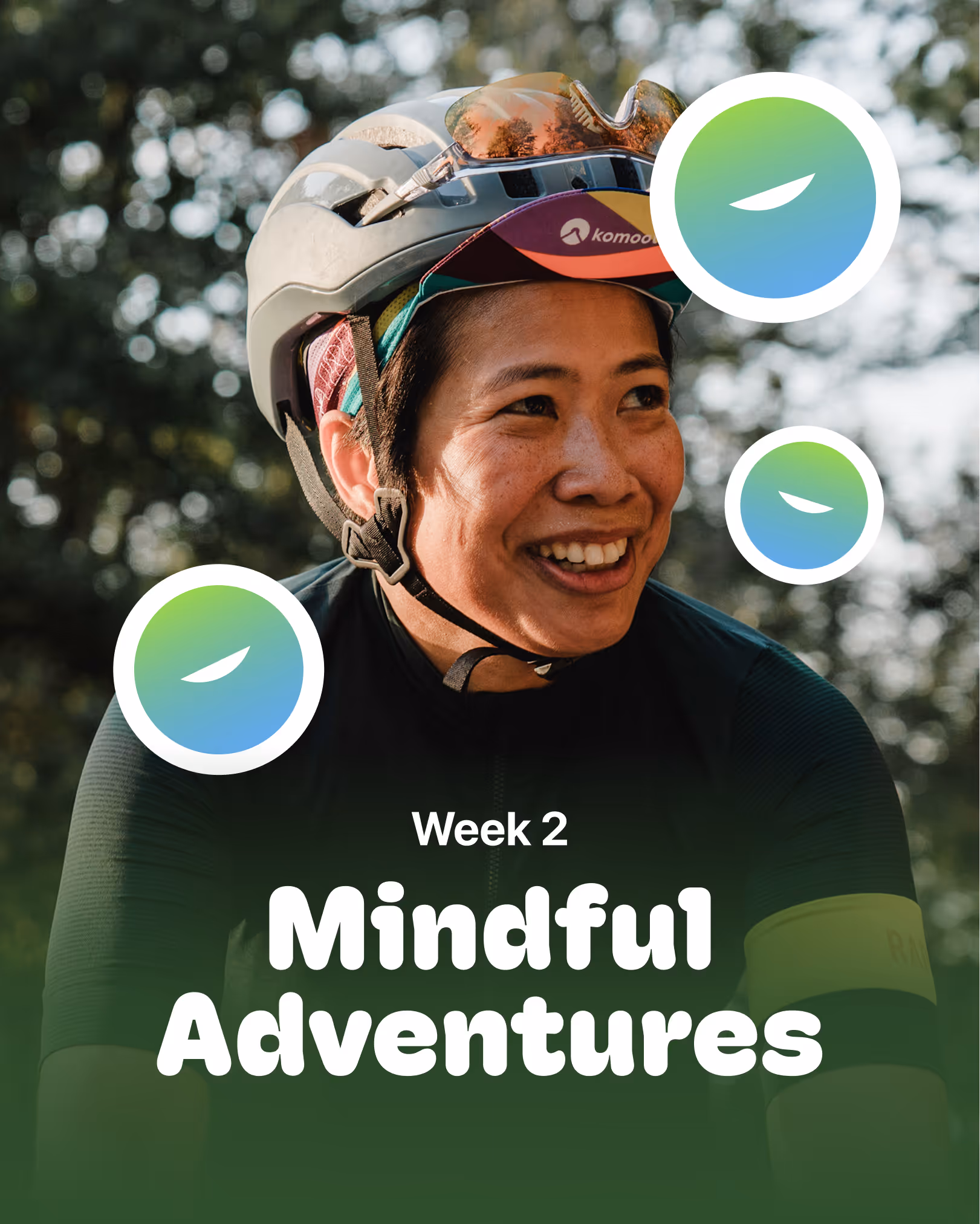
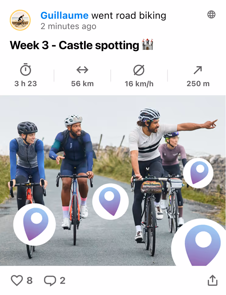
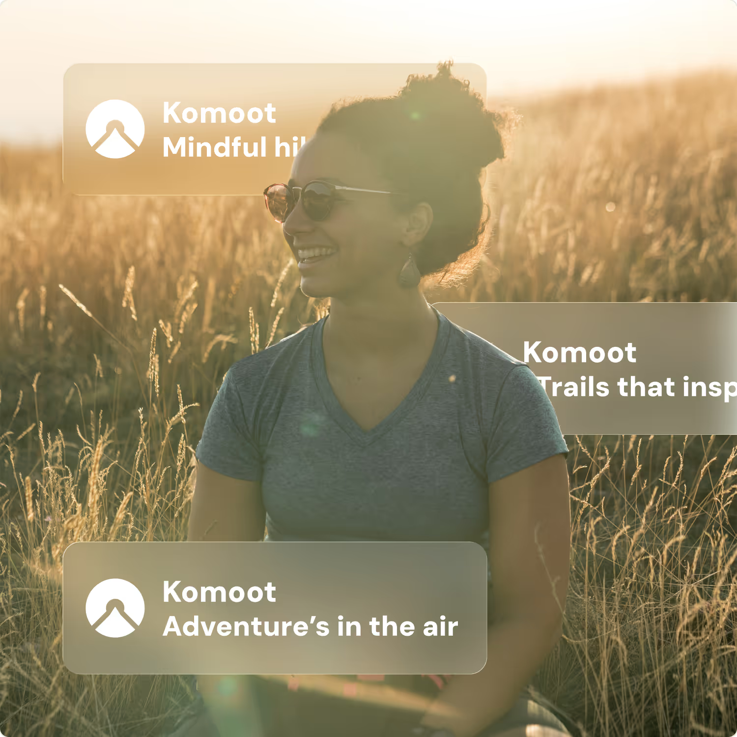
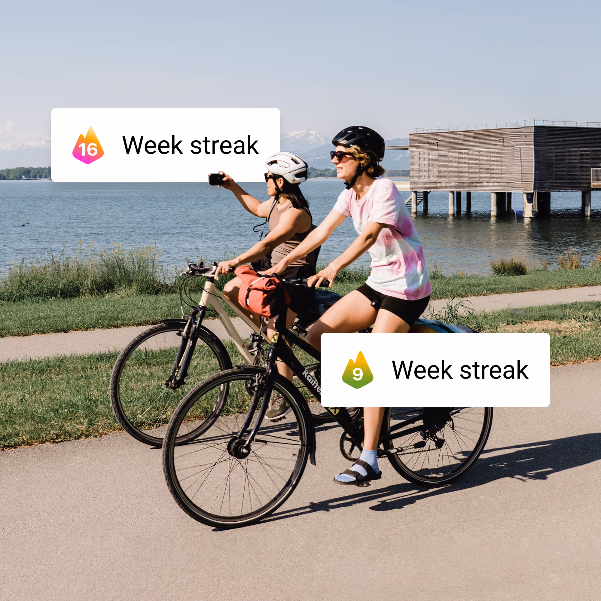
For each weekly theme, I selected uplifting, dynamic imagery that captured the campaign’s spirit and worked across emails, the app, and other compositions. The result is a cohesive visual set that encourages exploration and highlights the product feature.

One visual for each week of the month
The first step was to design a set of elements for each week's theme. Using the streak counter as a reference, I created four visuals that captured the campaign’s narrative topics: nature, mindfulness, landmarks, and picnic pauses.


Choosing the typography for the campaign
After defining these basic shapes, I looked for a font that would complement them. Given their rounded and playful character, I chose the heavy variant of Hoss Round, a friendly-looking font with soft, rounded curves that feels approachable despite its bold weight.


Choosing the imagery and putting everything together
For each weekly theme, I selected uplifting, dynamic imagery that captured the campaign’s spirit and worked across emails, the app, and other compositions. The result is a cohesive visual set that encourages exploration and highlights the product feature.