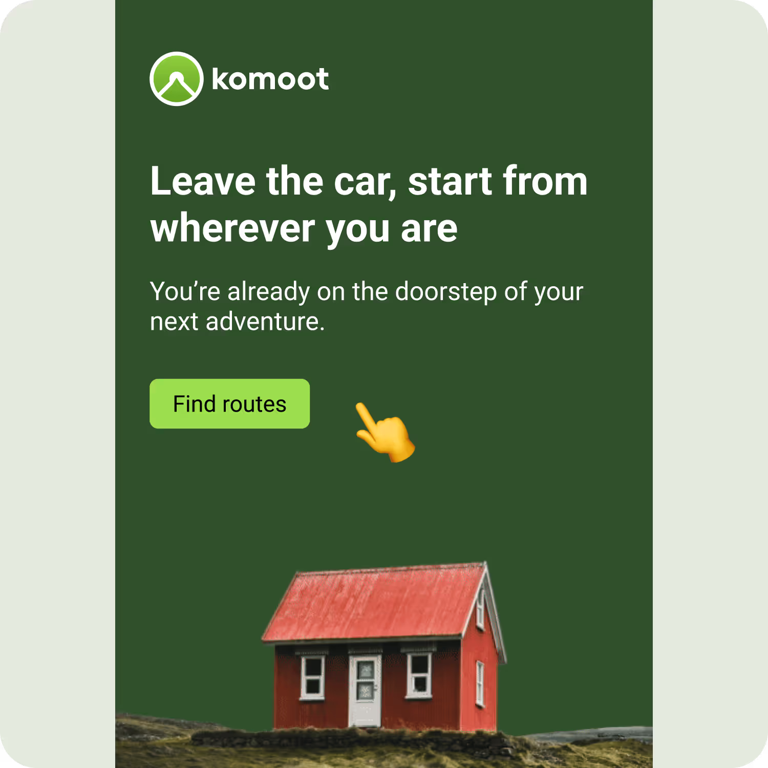
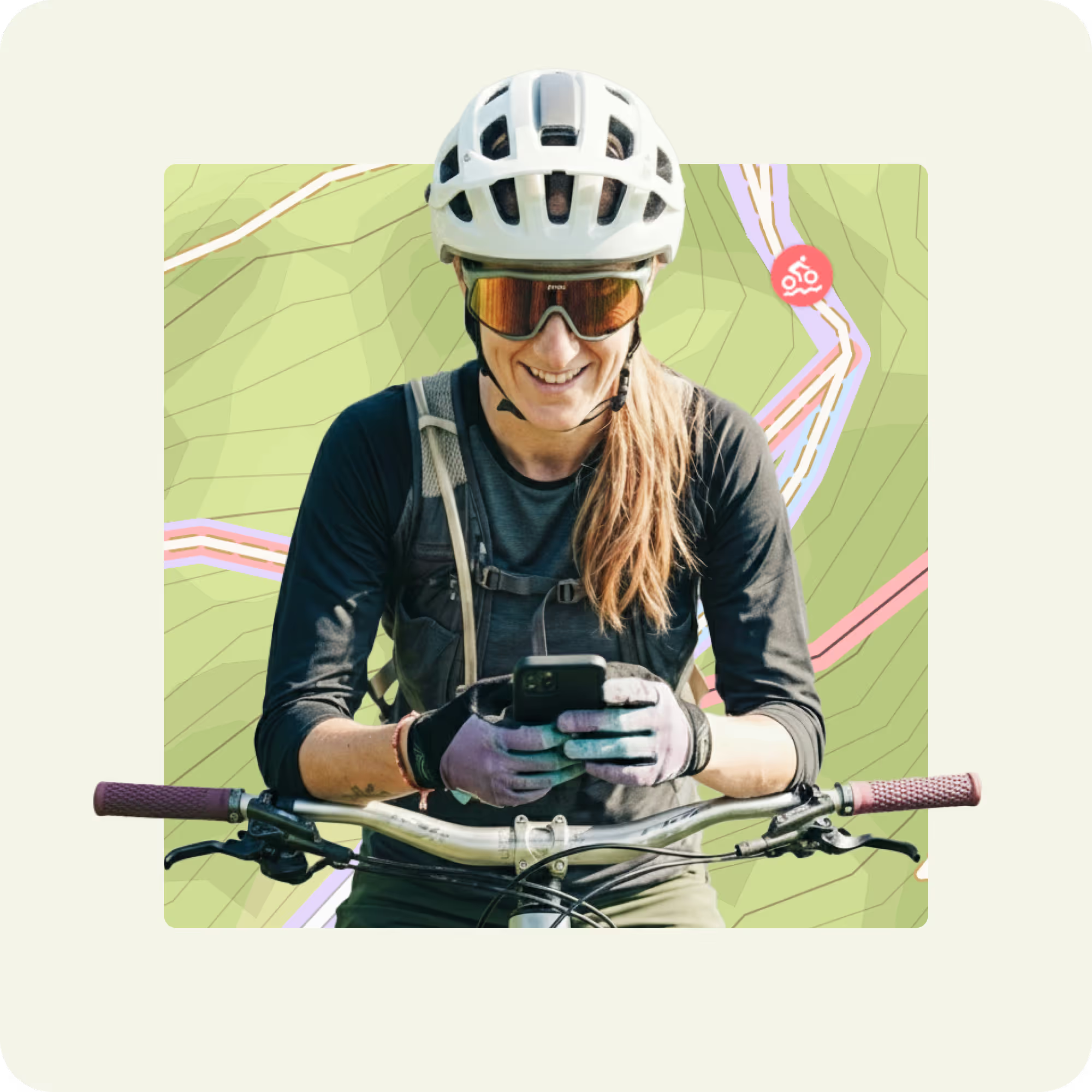
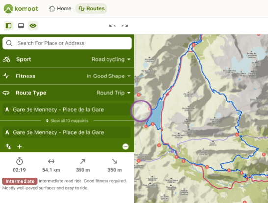
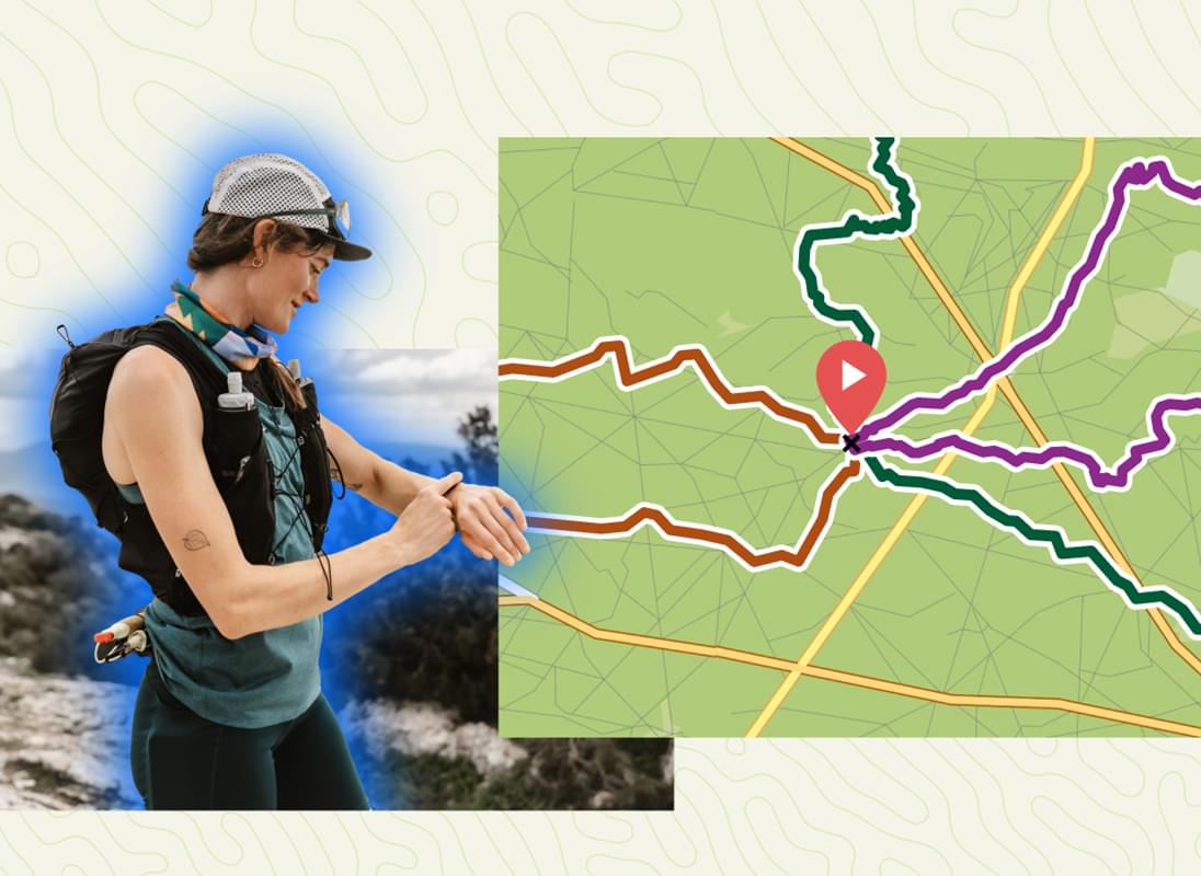
The fastest path to fun is from wherever you are and you can find routes that begin right there.
Find local trails
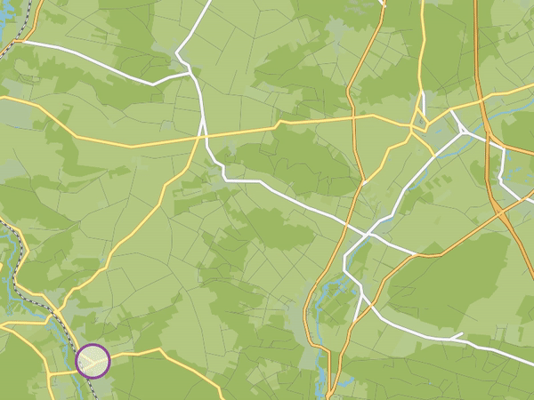
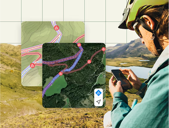
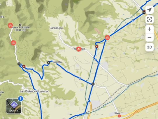
When you head to the map, you’ll immediately see routes that begin nearby or at your current location, depending on your sport.
Routes adapted to you
At komoot, we believe in ushering you out the door asap. That’s why the map takes popular existing local routes on komoot and alters their start and end points slightly just for you, so they begin wherever you want them to.
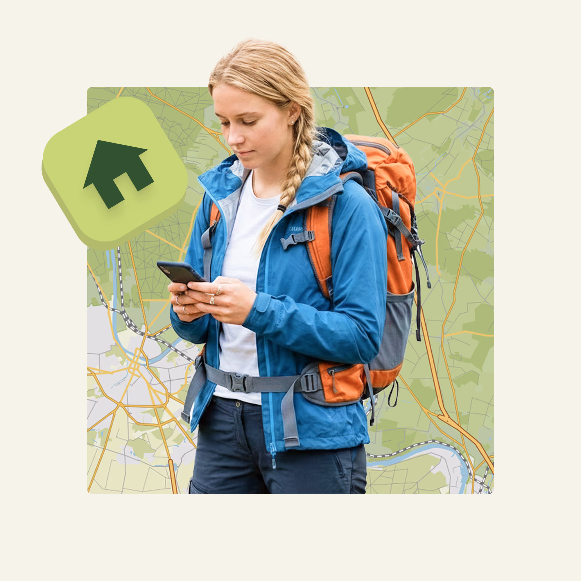
Search adventuresAdventure from home
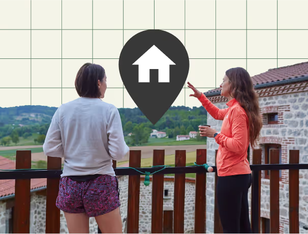
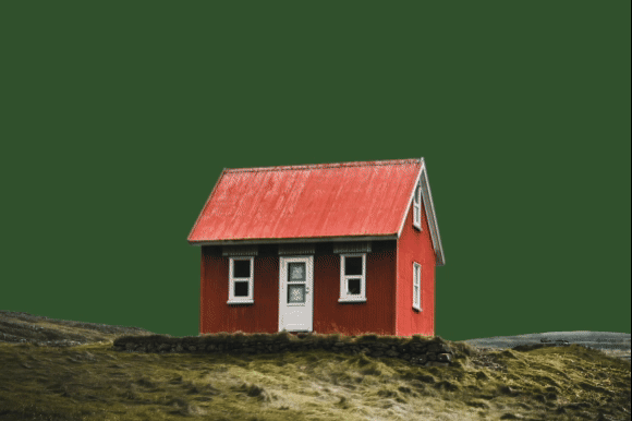
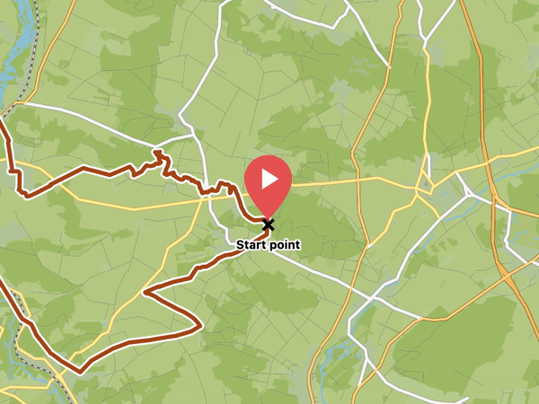
The best adventures often begin and end at home, where there’s a hot shower and a full fridge. When you save your home address, you’ll see a house icon appear on the map that you can tap to see routes for the sport you’ve selected. Only you can see suggested routes that start from your home.
Your home address is private and only visible to you. All completed routes have their start and end points covered by any privacy zones you set up before you completed the routes. You can learn more about privacy zones or setting your home address on our support pages.
Get started
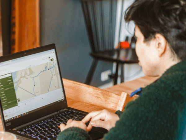
Just tap into the map’s search bar on komoot.com (not mobile) to find the set address prompt. Moving house or prefer using your friend’s apartment as your base? We got you. You can change your home address at any point from the search bar or from settings.